BRAND REFRESH
SILVERADO VINEYARDS
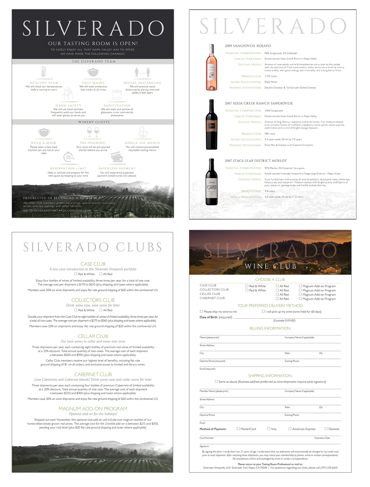
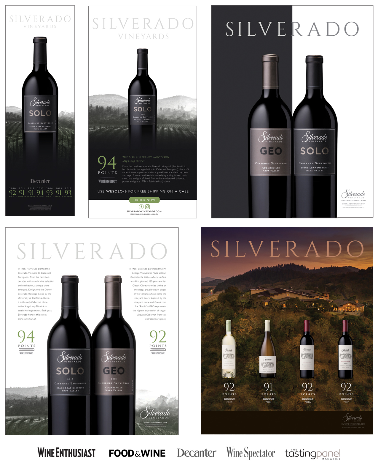
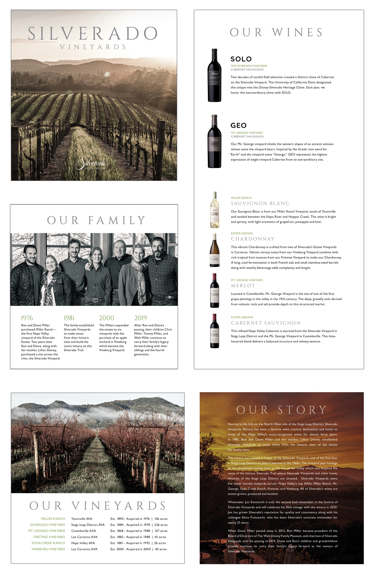
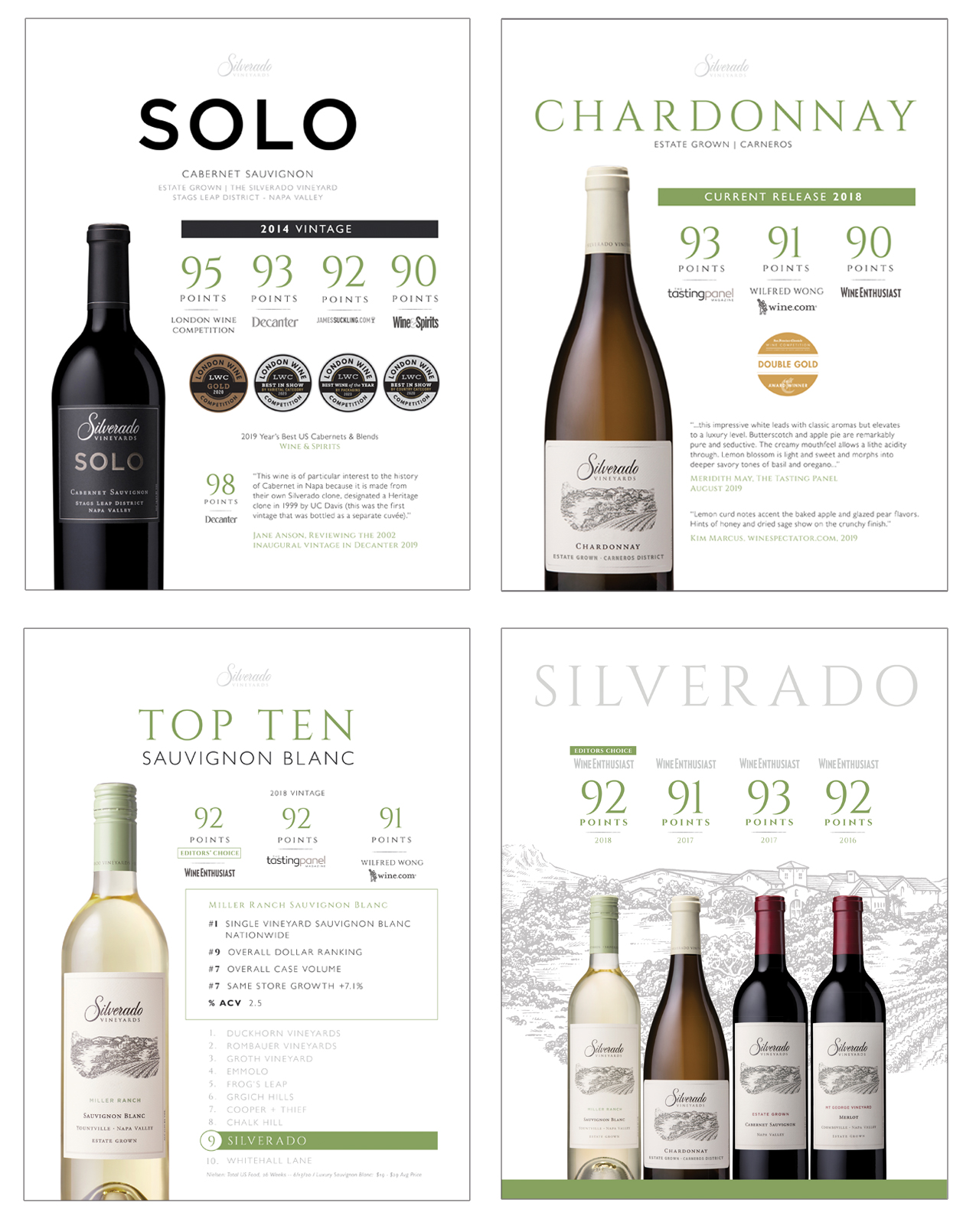
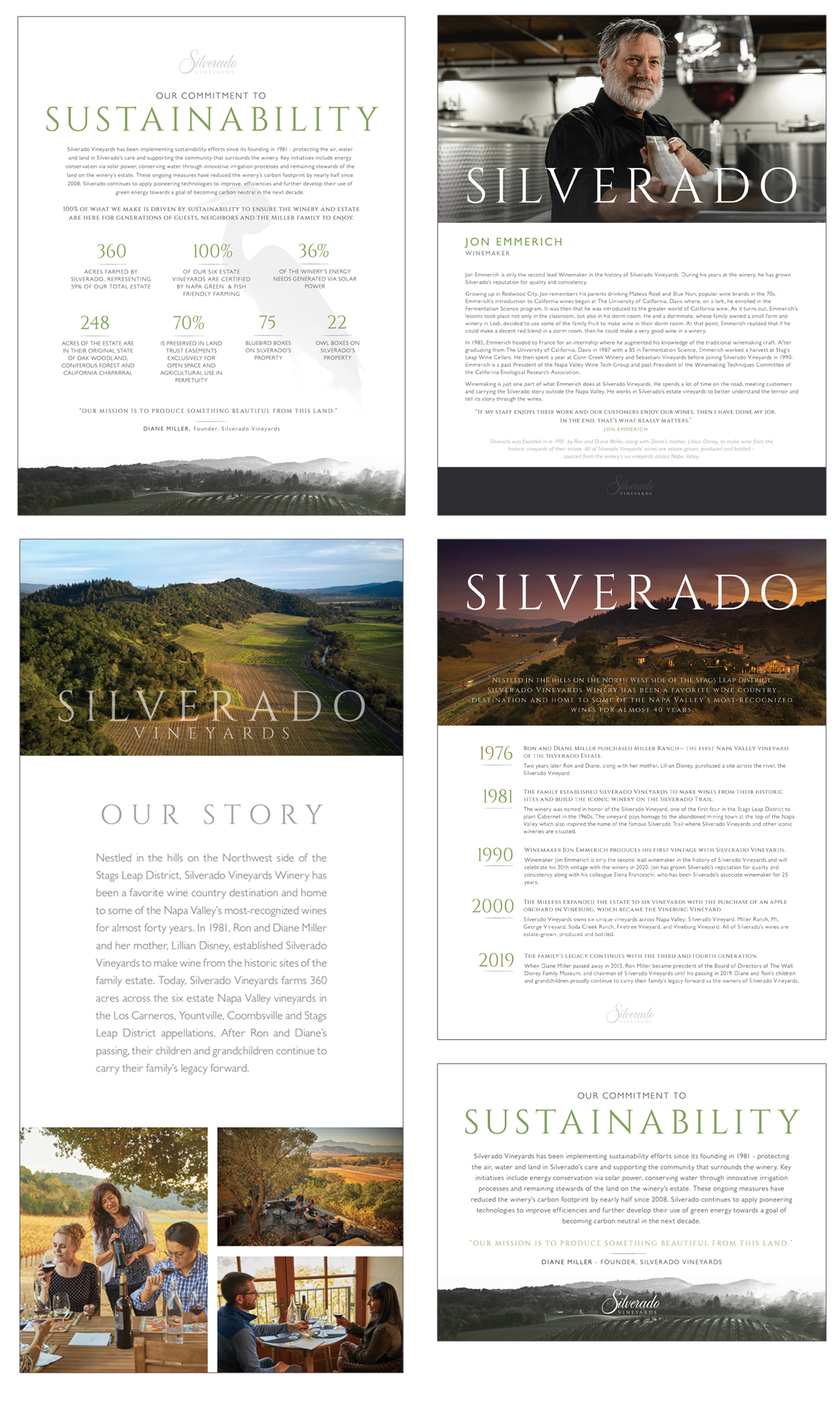
We produced a more contemporary look and feel for the company without deviating too far from the well-established brand identity, ensuring we were thoughtful about the family’s legacy. We used the brand’s existing photography to create artistic elements that tie to the family’s passion for the arts. Bold, minimal headlines showcase Silverado’s presence vs. relying on the logo alone. We also developed a second, more elevated style for the brand’s ultra luxury SOLO + GEO wines to separate out the tiers.
Today, almost all materials have been updated with the new branding, including: print + digital ads; brochures; wine club materials; sell sheets; tech sheets; presentations; and corporate collateral.
What we did
Concept Development
Branding
Creative Direction
Graphic Design
Photo Editing
Print Coordination
TRADE + CONSUMER ADS
BROCHURE
Sell Sheets
Company Collateral
Wine Club + Tasting Room
